
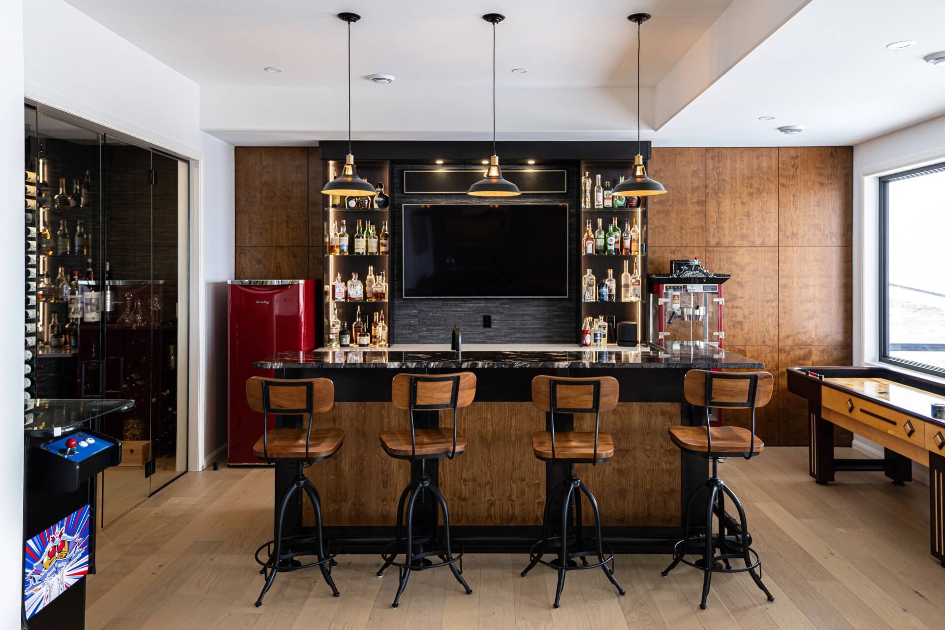
A Warmer Way to Colour the Kitchen
From softened greens to natural wood, today’s most inviting palettes feel layered, personal and at home for the long run.
A DESIGN NOTE FROM CATARAQUI CABINETS
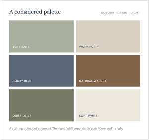
A kitchen colour can change the whole feeling of a home. The direction now is less about choosing one “it” shade and more about building a palette with warmth, depth and room to live.
A starting point, not a formula. The right finish depends on your home and its light.
Think softer greens instead of sharp brights, creamy neutrals in place of cool white, and wood tones that bring natural variation to the room. These colours have character, but they leave space for the countertop, hardware, favourite objects and everyday life to belong, too.
Start with the feeling you want
Before settling on a colour, look at what is already staying: flooring, counters, backsplash,appliances and the light that comes through the windows. A warm cabinet finish can make a cool stone feel more welcoming; a quieter neutral can let a dramatic countertop take the lead.
Colour samples are worth seeing in the room itself. Morning light, evening light and nearby finishes can all shift how a shade reads. Bring the pieces together before deciding, rather than choosing a door colour in isolation.
Five colour directions to consider
01 / GROUNDED GREEN
Soft sage and olive
Muted greens add a connection to the outdoors without turning the kitchen into a statement piece. Pale sage feels calm and airy; olive brings a little more depth. Pair either with warm white,natural oak or brushed metal for an easy, balanced mix. If you want to keep the colour understated, use it on the island or a pantry run.
02 / WARM NEUTRALS
Oyster, putty and mushroom
White still has a place, but warmer whites and earthy neutrals can feel softer than a crisp, cool finish. Oyster, sand, putty and mushroom sit comfortably beside wood and stone, and make aflexible backdrop for changing accents. Look at the undertone carefully: a neutral that appears creamy in one room may lean grey or pink in another.
03 / A QUIETER STATEMENT
Smoky blue
Blue is still a confident choice when it is softened with a little grey. Slate and inkier blue tones bring definition to an island or lower cabinets, while pale walls and warm wood keep the room
from feeling cold. The secret is balance: repeat a little warmth elsewhere, in the flooring, open shelving or hardware.
04 / NATURAL CHARACTER
Let wood be part of the palette
Wood is colour, too. White oak can read light and relaxed; walnut adds richness and contrast. A natural or stained finish brings grain and subtle variation that a flat colour cannot. Used across all the cabinetry or as a feature beside painted doors, wood gives a kitchen a sense of depth that feels personal rather than overly matched.
05 / THOUGHTFUL CONTRAST
Two tones, one clear story
A different colour on the island or lower cabinets is a simple way to add interest. Keep the pairing connected: a soft green with warm white, smoky blue with oak, or a deep wood tone witha putty neutral. Repeating one of the colours in a nearby detail helps the combination feel intentional, not like two separate decisions.
A useful rule of thumb:
choose the main cabinet finish for the feeling you want to live with every day.Bring in more adventurous colour through an island, a smaller cabinet run or details that are easier to change.
Make the trend your own
The best kitchen palette is not the one with the most colours; it is the one that makes the room feel right for the people who use it. Begin with the fixed finishes, decide where you want the eyeto land, then compare a small number of cabinet samples in your own light. A little contrast can make the details sing. A little restraint can help the whole room last.
At Cataraqui Cabinets, our design and making teams work together in Kingston to create cabinetry around the way you live. If you are planning a new kitchen, bring us your ideas and thefinishes you are considering. We can help you explore the colours, materials and details together.